―――――――――― ✧MURAL PROJECT✧ ――――――――――
Mural Art Project for Kuching’s SGH Heart Centre (2014)
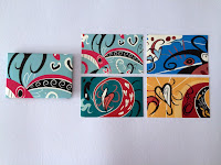
In 2014, a mural design project was commenced at the Sarawak General Hospital Heart Centre, on two blank walls near the entrance. According to the client’s needs, the mural is is preferably to have holistic visual image to convey happy, welcoming message to the public, and a heart symbol in it, depicting the hospital is mainly for patients with heart problems. The final design is based on Dayak culture motif, showing the Sarawak hornbill illustration, with lotus and heart holistic themed. The color chosen are associated with the Dayak color pattern and as well as Henri Mautisse's art style. These elements are what make the designs more Sarawak-themed and unique.
―――――――――― ✧INFORMATION & INTERFACE DESIGN✧ ――――――――――
Kuching's Weather Forecast App (Left)
Stalk-Eyed Fly's information sequence App (Right)
―――――――――― ✧PACKAGING DESIGN✧ ――――――――――
Packaging design for Sarawak Pepper
which shows different types of Sarawak pepper in the form of different Sarawak rainforest bird illustrations.
Packaging design for Sabah coffee
which shows different types of coffee in the form of different goat illustrations. The goat illustrations depict the history of coffee which can be traced back at least as early as the 9th century, in the highlands of Ethiopia. It is said that Kaldi discovered coffee after noticing that his goats, upon eating berriesfrom a certain tree, became so spirited that they did not want to sleep at night.
―――――――――― ✧WEBSITE✧ ――――――――――
Website redesign for Asia Music Festival
Asia Music Festival is a 2-day musical event featuring artistes and musicians from Asian countries namely from India, Korea, Indonesia, Brunei, Philippines and Malaysia. I was challenged to redesign the Asia Music Festival website for a school project (2014) to make it a better experience for its audience. In the previous version(left), the images and somewhat poor contrast are overwhelming for the page; the goal for this design revamp (right) is to tone that down, and make sure that the other stories following the main feature, together they look more pleasant, clean and easier to navigate.
(Website display link coming soon)
―――――――――― ✧MOBILE GAME/CODING✧ ――――――――――
Game link HERE
―――――――――― ✧CAMPAIGN✧ ――――――――――
Gang for Good is a hypothetical campaign which revolves around the idea of joining forces. The purpose of the campaign is to prevent youth from joining illegal gang membership and it is targeted towards parents and young people who are at risk of entering into a gang lifestyle. The campaign ads and activities would be run in Kuala Lumpur city and the campaign logo is carried across the city and other promo pieces. (Collaborative school project)
―――――――――― ✧IDENTITY✧ ――――――――――
The Pinnacles Kuching Lodge is a small, friendly lodge which situated on the highest point of the city hill, surrounded by entertainment venues where travelers find it convenient to access. Its key focus is to serve budget accommodation for travelers on the go where they can rest comfortably within their budget.
The Pinnacles Kuching Lodge logo (left) is very friendly-looking, simple and easy to understand. The simplicity house shape indicates the comfortable service there. However, one of the problems of the logo is the colors combination used. The colors are really flat and unappealing, causing the logo itself looks very cheap, untrustworthy and those leaves bad impressions for the society. The new logo (right) incorporates and represents the lodge's trust and friendliness to its customers and a promise of satisfaction. It takes the shape of a mountain with four peaks and slightly elongated steep from horizontal sides, suggesting direction and energy flow. Its two tone brown color suggests the feeling of wholesomeness, naturalness and dependability and also gives the logo a comprehensive look and welcoming message. This logo is carried across their lodge and other promo pieces.
―――――――――― ✧LOGOS✧ ――――――――――
Collection of experimental mark and logo works:
Logo for a hypothetical Beartorium Tour Journey (Left); Logo for Kuching's Friendship Park (Right)
―――――――――― ✧BOOKS LAYOUT✧ ――――――――――
Scrapbook design for Swinburne University of Technology Sarawak Campus's 2013 Student Council
Book design for Sabah Coffee
―――――――――― ✧PHOTOGRAPHY✧ ――――――――――


